
 |
|


Please read this entire page before sending artwork. The info on this page will help keep your order from being delayed because of problems with improper artwork.
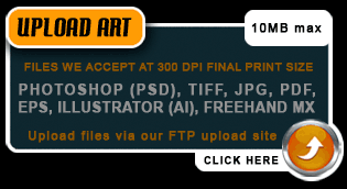
Formats that Contagious Graphics can accept for artwork:
• Illustrator (.AI)
• Vector (.EPS)
• Photoshop (.PSD)
• PDF
• JPG
• TIFF
All files must be at least 300 DPI at Actual Print Size or in a vector format. If your file is not 300 DPI at Actual Print Size, you cannot just increase the resolution of the file. This is called "upsampling" and will result in a blurry image.
We prefer .AI or .EPS files because Vector images can be scaled without affecting quality.
After that, .PSD or .PDF files are preferred, and then .JPG or .TIFF last.
Size Your Design - Your design should be sized to the size it should be printed. If you want your print to be 10" wide, please be sure the actual design within the file is 10" wide, not just the background of your design file.
Return to Top↑
Return to Top↑
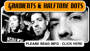
Drop shadows, gradients, photographs and what halftone dots are...
The design the way it looks in Photoshop
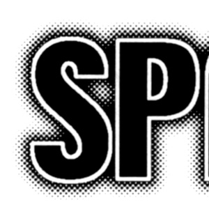
A blown up section of the sticker after it is screenprinted.
 |
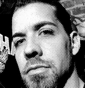 |
A photograph the way it looks in Photoshop |
A blown up section of the photo after it is printed with halftone
dots. |
Be aware if you will be using gradients in your design, that this is how they will look when printed. If you do not like the way gradients look when printed, the alternative is to just use solid areas of color (which means using additional ink colors).
Let us set up the halftone: Please allow us to halftone the images for you. If we do not control the halftones, we cannot guarantee the quality of the print. We do understand that some designs are complex, and you may be inclined to try to separate or halftone the image yourself. Unfortunately this does not work. Our art department have the knowledge to set halftones specifically for the films and screens that we use for printing. Often times if you try to separate or halftone the image yourself, your artwork can be deemed unusable for screen printing.
If you have any questions about the above information or some other
question about artwork, please give us a call (704.529.5600) or e-mail
us and we will be glad to help you out.
The simpler the better - Since people
are viewing it from moving cars or glancing at it while moving from
section to section at a record store, in a club, etc.
Make it eye catching - Use bold logos, cool artwork, or a
photograph. When using photos or shaded images (read about gradients/halftones)
the halftone dots will be large just remember the viewing distance is
normally 4-6 feet not 6 inches from the viewer's face.
Return to Top↑
Sticker templates - For your convenience, we have provided Standard Sticker Templates you can download. The file options available are EPS, TIFF and PSD. You can use these templates to help create your artwork and make sure you have everything set up correctly from the beginning.
Keep it simple - A simple, high-contrast design works best. Most stickers we make are smaller sizes than the traditional "bumper sticker." Therefore, designs should be clear, easy to read and use bold lettering. Look at our sticker samples for some ideas.
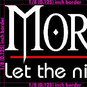
Watch your borders/inset - For a Standard
Sticker, you need to keep a
solid 1/8 inch (0.125") border around your artwork
of either White, Black, or Red. If not, we will need to add one
around the artwork for you and this could delay your order. We do not
do custom multi-color bleeds (this is when an element of your design
(such as text) goes to the edge of the sticker) on Standard
Sticker orders of 500 or less. We can do custom
multi-color bleeds on Custom
Stickers orders of 500 or more.
Use solid colors - Try to avoid shading, gradations, and blends. Designs or photographs with fine shading may drop out and will be created using halftone dots. Use solid fills and outlines for best results.
Create a smart design - Use reversed/inverted images and printed backgrounds to your advantage. Black text printed on a white background can seem pretty plain, try reversing/inverting your image. You will end up with what appears to be white text (the vinyl showing through) on a black background (the actual printed ink). This design will have higher contrast and is more "eye catching"
4 ink colors doesn't mean "Process color" - We can print 4 spot ink colors (or more) or 4 Color Process (aka 4C Process, CMYK, Full Color), but they are NOT the same thing. 4 Color Process is how full color magazine images are printed. Semi-opaque Cyan, Magenta, Yellow, and Black ink are printed so that they combine optically to create the appearance of a full color image. Please be aware that 4 Color Process WILL NOT look as good on a sticker as it does in a magazine (screenprinters use larger halftone dot screens than offset magazine printers). 4C Process stickers and 4 spot ink color stickers are available as a custom sticker order and are priced the same.